What are the new options?
I showed them below the print screen.
It’s a text hide, a text blur and polls
Thanx the poll maker I knew 
Why is the article author’s name so ironic? 


Unfortunately this article is 4 times longer than my attention span lasts  but I get the gist.
Just too unromantic This Brain related stuff
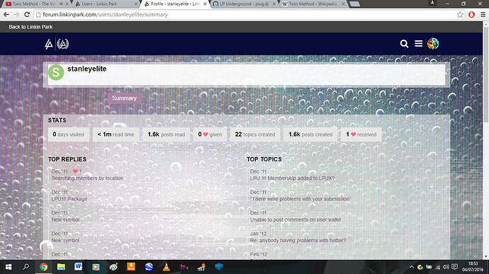
Stanley hasn’t been active in years in the LP world, how did this come up?
EDIT: We just had a power cut out of the blue.
I was checking the members section to see who had the most all time posts and he was somewhere around the top-ish. It’s just that the stats looked hacked.
Dunno… I know him, he wouldn’t hack it or anything.
Also, it seems that the power station that covers my neighbor has caught on fire due to some explosions. I don’t think we’ll be getting the power back soon.
Apparently my grandparents are coming over today. We’re picking them up from the airport this afternoon. That means I have to sleep in the living room again. Shame I’m getting bored of gaming, because if I wasn’t I’d spend all night on my ps3 
It seems sleeping in the living room isn’t as nice as I remember. I had nothing to do on my ps3 or online last night so i decided to go to sleep except the ticking of the living room clock kept me up, then my sister walked in at 07:40 because she had school so i only got 5 hours last night. Luckily the clock is in the kitchen during the nights now. 1 day down, 8 to go 
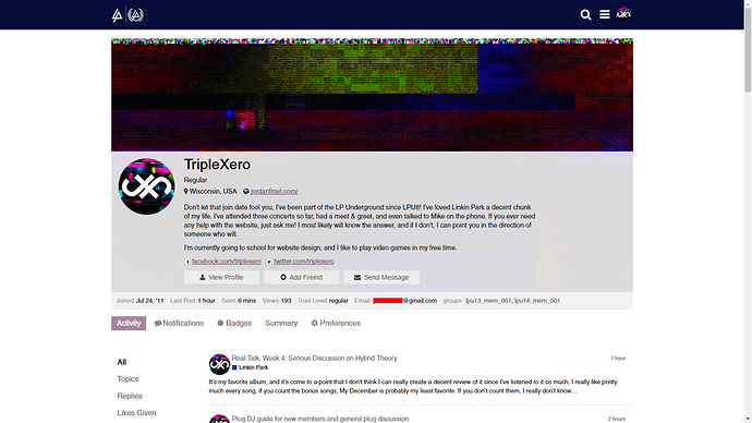
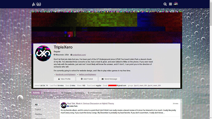
So I’ve noticed that Discord really isn’t designed to have a background image, and a lot of the bad design choices on the forum seem like side effects of it having one, or trying to fix stuff affected by it
Without non-default styles:
With non-default styles:
You can tell some boxes are stretched more than they should be causing some issues, as well as text being too close to edges of boxes because normally there’s not a defined outline for the boxes
The slider on the side doesn’t look as bad either
So what is it that causes the change?
If you mean the boxes being sized differently, it’s most likely whoever did the CSS for the forum trying to compensate for the background being there.
Since it’s usually all white, having different colored text usually wouldn’t be a problem, but since there’s a background image, the color behind the text varies and that’s hard to do. Most the areas on the forum usually don’t have their own dedicated background color and just rely on the site’s overall white background, so stuff like this happens:

Some more important stuff was given a background, but then this happens:
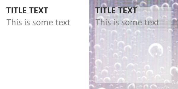
Text is right up against the side of the box, since there wasn’t visible boundaries before, which is readable, but bad graphic design. So then to fix that, this is done:
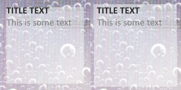
But as a side effect of this, some of these elements are used elsewhere, where they don’t need the extra padding around the box to make it look good, so then you go back up to the first image in my previous post and see the “about me” section has that padding, too, which makes it look wose
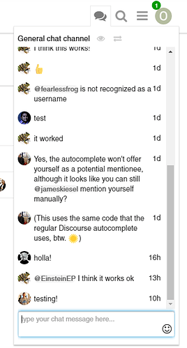
Which site is that on? I know it’s from the providers for this forum but the feature isn’t there.
It’s a plugin made by someone other than the developers for Disourse itself. I believe it’s called Babble and there’s a test forum dedicated to it
Why is it that I feel absolutely not difference between getting 3 hours of sleep and ~9 hours of sleep?


