
Ah yes, I understand. What do you suggest as an improvement? Just an underline or something different?
1 Like
Oh… how nice that you ask
  - maybe underlined italic would be more decent
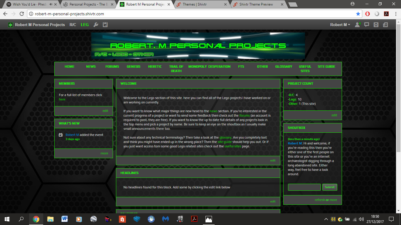
Looks really cool! The site is clear and navigating is simple and logical.
I agree about the banner, you should create a simple but effective logo or something.
Loading pages with photos took a bit long, though I don’t really know what’s causing it.
1 Like
Yeah- red is teachers and profs colour ( in my mind) and heey @rickvanmeijel  seeing you typing atm
1 Like
I don’t know what the issue was there either, they’re not big photos. My old site loaded massive ones just fine. I’m not sure I can do anything about that.
Yeah, I’m looking into that.
I use it to draw attention where needed. 
1 Like
Perhaps you could use multiple pages for photos and not put them all on one long page.
That’s an option but I’m not sure if it will solve the problem because for me it takes a moment to load pages with a single pic.
I wouldn’'t do one pic per page but several per page
I get what you mean. I’ll probably break it into extra tabs. The only part where there’s too many images is in Banshee’s section. The rest are more or less ok.
EDIT: I just spread them out, seems fine on my side. Is it ok on yours @rickvanmeijel ?
Yes this is better
1 Like
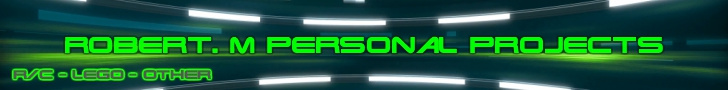
Ok, so I came up with some banners, but I’ not sure which I should use. Personally I find myself slightly more drawn to XP1 but I’m happy with the others. Which do you guys think looks best? Or do they all need rethinking?
Here they are and what they would look like (there’s no XP2 because it was rubbish).
XP1:
XP3:
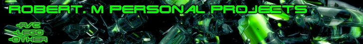
XP4:
- XP1
- XP3
- XP4
0 voters
@lpfan61
@AJ_7
@rickvanmeijel
@theearlywalker
@Honey8
@hilaryfol
@framos1792
2 Likes
I just think maybe it looks a bit cleaner, less busy
Overall though they’re all pretty cool
1 Like
XP4 seems to blend better with the background, that was actually my second choice
Exactly, and in a way it reminds me of a letterhead along with the shortcuts being right under it
1 Like
I was torn between 1 and 4 too! I will check out the rest of your website tomorrow if you don’t mind! Had quite a tiring day today. From clicking it and just looking at the front page it looks pretty good! Well done!
1 Like
Everyone can ignore this post.
Ignore
@the_termin8rI really like the xp1
1 Like
It looks great! I just got a chance to go through it. I meant to not spend more than a few minutes going through it, but the lego part of the site got me spending a good chunk of time! Well done!
1 Like
I trust you found that it was pretty much identical to the OP then
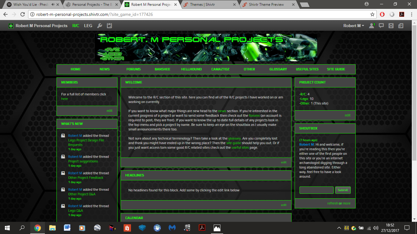
Also by the looks of it, XP1 has been voted as the banner to use on the site. Thanks everyone.
4 Likes