I feel like a Linkin Park groupie at this point.


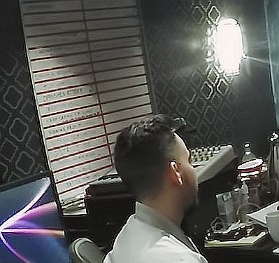
On the first image there is one title that looks like “OPPOSITES ATTACK”, but I can’t make much out of it.
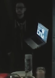
On the second image there is a guy holding a notebook and showing previous album covers.
Looks like they were discussing a possible album title/art when the video was made.
opposites attract?
May be, sounds better 
did that just come up somewhere?
Interesting… whi is that guy holding the laptop?
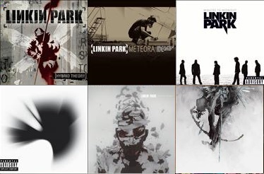
As I said he has all the album covers opened on his laptop screen (Hybrid Theory, Meteora, Minutes To Midnight, A Thousand Suns, Living Things, The Hunting Party). My guess is that he was showing them to the band, so they could discuss about the next possible album cover.
Shit, I meant to ask whO that guy is haha
Haha, I don’t know, Lorenzo maybe?
give me a moment to run my faces recognition software 
we should ask the NSA
I also see Opposites Attack, in all caps. I think it sounds better than Opposites Attract. It sounds less cliché.
@tenkaichi They always do rehearsals to see how the new material sound, find out how to play them live and how they’d fit in the set with everything else. It takes ages to do so I’m not surprised at all they have began.
The guy with the laptop is not Lorenzo btw.
nooo Lorenzo is much mo beautiful lol
XD
On the second picture, he was probably saying to the band “guys, it’s time to get rid of the black/grey/white colour scheme that we’ve had for the past 4 albums” I actually don’t mind what colour the artwork is, as long as the music is great (which it always is). Just a different colour would be nice
Adding in a little color to their color scheme couldn’t hurt. Something subtle perhaps.

This is the new album cover 
Yeah nothing too bold, maybe a hint of navy blue or something
I was thinking adding 2 or 3 very poppy colors, but keeping them thin and subtle, offering a minimalistic look. (On top of their usual thing they do.)
