Is it just me or is the forum spazzing again? Rainbow divider on a light background… Maybe it’s cause I’m tired but my eyes hurt while looking at the forum now.
It looks like this right now:
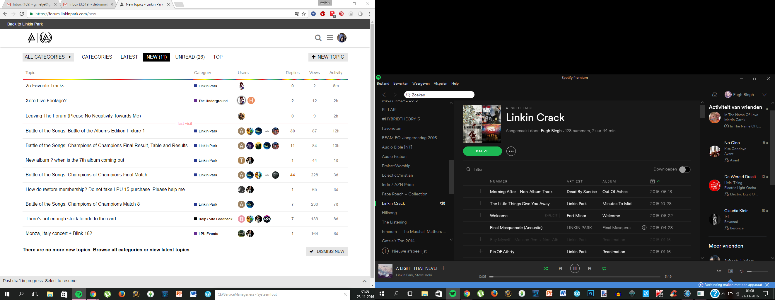
[do ignore the right part of the screenshot]

Is it just me or is the forum spazzing again? Rainbow divider on a light background… Maybe it’s cause I’m tired but my eyes hurt while looking at the forum now.
It looks like this right now:
[do ignore the right part of the screenshot]
That’s the LPU 16 theme.
So much easier to read everything now! Glad it switched to the LPU 16 theme.
I like the addition of the dividers. I’m not really a fan of the larger font, though.
Or the white background that we’ve had since LPUX.
nice rainbow lines, the whole style is sooo smooth to my eyes - this a case of first view love in my case
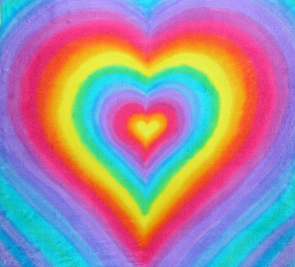
The white bg is too bright and the rainbow lines just look out of place to me.
I don’t mind rainbows. But the white background is a sore to my eyes. If only we could choose the color of the backgrounds ourselves… For at least the forums…
This new design looks cool , but the LPU 15 one was… m… less aggressive
Yeah, the rainbows are so violent to the eyes man!
It’s too white…and my family is annoying me for the holidays…well time to bake cookies
i like its new lol
Very fresh… lol ( german people keep telling "fresh"as the new word for awesome  )
)
I usually just go directly to the forums. Tried looking through the website this afternoon since weeks. Wow, what an improvement! Looks very fresh indeed.
The forum could still use something, though… Like, something less painful to the eyes 
I liked the new layout of the site. And don’t have problems with the white bg, for me it’s easier to read. And I liked the rainbow as well, gives it a little bit of color.
They need to have it as a dark grey with white writing.
What’s is missing in my opinion is a different colour for links. Right now you can’t make them out at all.